Plus, receive recommendations and exclusive offers on all of your favorite books and authors from Simon & Schuster.
Published by Manning
Distributed by Simon & Schuster
Table of Contents
About The Book
Radically improve the quality of your data visualizations by employing core principles of color, typography, chart types, data storytelling, and more.
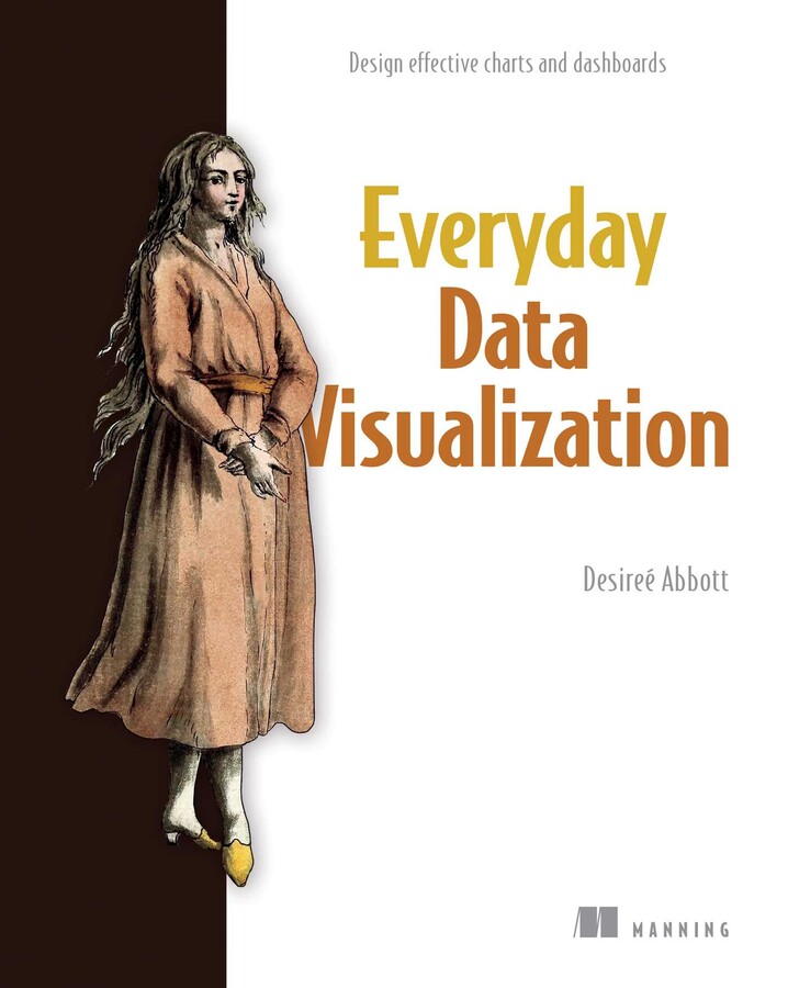
Everyday Data Visualization is a field guide for design techniques that will improve the charts, reports, and data dashboards you build every day. Everything you learn is tool-agnostic, with universal principles you can apply to any data stack.
In Everyday Data Visualization you’ll learn important design principles for the most common data visualizations:
This book gives you the tools you need to bring your data to life with clarity, precision, and flair. You’ll learn how human brains perceive and process information, wield modern accessibility standards, get the basics of color theory and typography, and more.
Purchase of the print book includes a free eBook in PDF and ePub formats from Manning Publications.
About the technology
Even mundane presentations like charts, dashboards, and infographics can become engaging and inspiring data stories! This book shows you how to upgrade the visualizations you create every day by improving the layout, typography, color, and accessibility. You’ll discover timeless principles of design that help you highlight important features, compensate for missing information, and interact with live data flows.
About the book
Everyday Data Visualization guides you through basic graphic design for the most common types of data visualization. You’ll learn how to enhance charts with color, encourage users to interact and explore data and create visualizations accessible to everyone. Along the way, you’ll practice each new skill as you take a dashboard project from research to publication.
What's inside
About the reader
For readers experienced with data analysis tools.
About the author
Desireé Abbott has over a decade of experience in product analytics, business intelligence, science, design, and software engineering.
The technical editor on this book was Michael Petrey.
Table of Contents
PART 1
1 Hello, data viz!
2 How we perceive information
3 It’s all about the data
PART 2
4 Choosing colors
5 Typography
6 Creating a good chart
7 Designing for interactivity
PART 3
8 Research, design, and development
9 Troubleshooting
Appendix
Everyday Data Visualization is a field guide for design techniques that will improve the charts, reports, and data dashboards you build every day. Everything you learn is tool-agnostic, with universal principles you can apply to any data stack.
In Everyday Data Visualization you’ll learn important design principles for the most common data visualizations:
- Harness the power of perception to guide a user’s attention
- Bring data to life with color and typography
- Choose the best chart types for your data story
- Design for interactive visualizations
- Keep the user’s needs first throughout your projects
This book gives you the tools you need to bring your data to life with clarity, precision, and flair. You’ll learn how human brains perceive and process information, wield modern accessibility standards, get the basics of color theory and typography, and more.
Purchase of the print book includes a free eBook in PDF and ePub formats from Manning Publications.
About the technology
Even mundane presentations like charts, dashboards, and infographics can become engaging and inspiring data stories! This book shows you how to upgrade the visualizations you create every day by improving the layout, typography, color, and accessibility. You’ll discover timeless principles of design that help you highlight important features, compensate for missing information, and interact with live data flows.
About the book
Everyday Data Visualization guides you through basic graphic design for the most common types of data visualization. You’ll learn how to enhance charts with color, encourage users to interact and explore data and create visualizations accessible to everyone. Along the way, you’ll practice each new skill as you take a dashboard project from research to publication.
What's inside
- Bring data to life with color and typography
- Choose the best chart types for your data story
- Design interactive visualizations
About the reader
For readers experienced with data analysis tools.
About the author
Desireé Abbott has over a decade of experience in product analytics, business intelligence, science, design, and software engineering.
The technical editor on this book was Michael Petrey.
Table of Contents
PART 1
1 Hello, data viz!
2 How we perceive information
3 It’s all about the data
PART 2
4 Choosing colors
5 Typography
6 Creating a good chart
7 Designing for interactivity
PART 3
8 Research, design, and development
9 Troubleshooting
Appendix
Product Details
- Publisher: Manning (May 28, 2024)
- Length: 264 pages
- ISBN13: 9781633438408
Browse Related Books
Resources and Downloads
High Resolution Images
- Book Cover Image (jpg): Everyday Data Visualization Trade Paperback 9781633438408


